Click here to Skip to main content
65,938 articles
CodeProject is changing. Read more.
Articles / desktop / Win32

SolidWidgets Grid

5.00/5 (2 votes)
17 Jul 2012CPOL2 min read 12.7K   482  
SolidWidgets Grid tutorial.

Introduction

FREE for PERSONAL and COMMERCIAL use

The SolidWidgets UI framework includes a powerful GRID control that can be bound to a database table, and to cached memory. The memory mode of the grid allows for unlimited number of rows to be added to the grid from any external source, and the database mode fetches its data directly from the database, and also allows for unlimited number of rows to be displayed and manipulated. The grid can be configured for up to 255 columns, and each column can be configured to be readonly, editable, editing style, which includes simple text edit, combobox, checkbox, button, image, spinner, masked, numeric, etc. The grid can also be configured to display all the columns by scaling them according to the size that you set for each column, or it can display whatever number of columns that can be fit on the current screen, you would then scroll left and right to view the rest of the columns. These are just few of the features that are supported in this grid.

Using the SolidWidgets GRID class

In order to add a grid to a window in your application, first declare an instance of swTable, configure the grid through this instance, and then add the instance to the window. Following is an example of how a grid is addd and manipulated:

Let's create a dialog class that will display our grid. The dialog class will be made up of the header (GridDemo.h), and the implementation file (GridDemo.cpp). Here are the contents of the 2 files:

C++
[GridDemo.h]
    
#pragma once

#include <swtable.h>
#include <swDialog.H>
#include <swbutton.h>
#include <swVector.h>

class GridDemo: public swDialog
{
    swTable m_grid;
    swButton m_okBtn,m_cancelBtn;

public:

    void windowOpening();
    void windowOpened();
    BOOL windowClosing();
    void windowClosed();
    void actionPerformed(long sourceId,long eventId,const swString& eventName);
};

Now here is the implementation file of our dialog class:

C++
[GridDemo.cpp]
    
#include "GridDemo.h"

void GridDemo::windowOpening()
{
    setSize(800,600);

    // In order to add controls to a dialog window, we first obtain
    // a handle to the root panel of the dialog as shown below:
    swPanel *contentPane = getContentPane();
    if(contentPane!=NULL)
    {
        // We now initialize the panel to set the layout so that the dialog
        // will display a grid that occupies the full width of the
        // dialog client area, minus the marging of 10 pixels to the right
        // and left side of the dialog. It will also display the OK and
        // CANCEL button below the grid, with a gap of 10 pixels between the
        // grid and the buttons below it. The buttons will be right aligned
        // with the grid. Here is how we can achieve this layout:

        // Set the dialog to have a margin of 10 pixels on all sides:
        contentPane->setMargins(10,10,10,10);

        // Add the row that will be occupied by the grid. This row will be a filler row,
        // meaning it will occupy whatever available space not used by the buttons.
        contentPane->addRow();
        // Add a gap of 10 pixels to separate the grid from the buttons below it.
        contentPane->addRow(10);
        // Add a row that will be occupied by the buttons. The row will have a fixed 25-pixel height
        contentPane->addRow(25); // Button Row

        // Now let's specify the column layout of the dialog. The dialog will
        // have 3 columns. The grid will occupy columns 0,1,and 2. The OK button will occupy
        // column 1, and the CANCEL button will occupy column 2.
        // Here is how we specify that using the solidwidgets layout manager:
        contentPane->addColumn();
        contentPane->addColumn(100); // OK Button
        contentPane->addColumn(100); // Cancel Button

        // Finally, we add our components to the dialog:
        // The grid will occupy the top row, and all three columns to
        // fill the entire with of the top portion of the dialog: row 0, columns 0,1,2
        contentPane->addChild(&m_grid,0,0,3,1);
        // The OK button is placed at row 2, column 1
        contentPane->addChild(&m_okBtn,1,2,1,1);
        // The CANCEL button is placed at row 2, column 2
        contentPane->addChild(&m_cancelBtn,2,2,1,1);
    }

    // Now that we have laid out the components of the dialog, let's initialize the grid and the buttons

    // Initialize the grid
    // Set the grid title
    m_grid.setTitle(L"Grid Demo");
    // We want the grid to display all the columns simultaneously, so we will tell
    // the grid to scale the columns instead of using the exact pixel size that we specify:
    m_grid.setColumnWidthByRatio(TRUE);
    // Configure the grid to show a row under the column headers to allow
    // the user to search for any cell value on any column in the grid:
    m_grid.setAllowSearch(TRUE);
    // ADDING COLUMNS:
    // Add a name column that will be editable with a simple text editor. The column width
    // ratio will be 2, which means the width will occupy twice as much space as a column with a width ratio of 1 :
    m_grid.addColumn(L"Name",L"Name",20,2,TRUE,TEXTEDIT);
    // Add a gender column that will be editable with a combo box. The user will
    // edit this column values by selecting a value from a dropdown list:
    m_grid.addColumn(L"Gender",L"Gender",20,1,TRUE,COMBOEDIT);
    {
        // Since this column is editable with a combobox, we need to set
        // the list of choices that the user can select from at runtime:
        swVector<KeyValue> genderOptions;
        genderOptions.push_back(KeyValue(L"M",L"Male"));
        genderOptions.push_back(KeyValue(L"F",L"Female"));
        m_grid.setComboColumnOptions(L"Gender",genderOptions);
    }
    // Add an IsSeniorCitizen status column which will be editable by a checkbox.
    m_grid.addColumn(L"IsSenior",L"Is Senior",1,1,TRUE,CHECKEDIT);
    // Add an AGE column that will be editable with a SpinEdit
    m_grid.addColumn(L"Age",L"Age",5,1,TRUE,SPINEDIT);
    {
        // Since this is a column editable with a spinbox, we must specify the range values
        swVector<KeyValue> ageOptions;
        for(long i=0;i<125;i++)
        {
            KeyValue newVal(L"",L"");
            newVal.key.format(L"%d",i);
            newVal.value.format(L"%d",i);
            ageOptions.push_back(newVal);
        }
        m_grid.setSpinColumnOptions(L"Age",ageOptions);
    }
    // Add a birthdate column that will edited with a date edit control
    m_grid.addColumn(L"BirthDate",L"DOB",12,1,TRUE,DATEEDIT);
    // Add an Income column that will edited with a numeric edit control
    m_grid.addColumn(L"Income",L"Income",20,1,TRUE,NUMERICEDIT);
    // Add a telephone# column that will be edited with a masked edit control
    m_grid.addColumn(L"Telephone",L"Telephone",20,1,TRUE,MASKEDIT,L"(###) ###-####");
    // Finally, add a column that will allow the user to perform some kind of action of the row
    m_grid.addColumn(L"Options",L"Other Options",20,1,TRUE,BUTTONEDIT);
    //
    // Now that we added ourt columns, we must tell the grid how it will get the data that
    // it will display. In this case, we will be feeding the data manually, so we bind the grid to
    // the cached memory source:
    m_grid.bindToCache();
    //
    // Let's add some sample data
    if(m_grid.addRow())
    {
        m_grid.setColumnValue(L"Name",L"John Doe");
    }
    if(m_grid.addRow())
    {
        m_grid.setColumnValue(L"Name",L"Jane Doe");
    }
    //
    // Initialize the buttons to set the text that will be displayed on each button,
    // and to register this dialog to list to their action events:
    m_okBtn.setActionListener(this);
    m_okBtn.setText(L"OK");
    m_cancelBtn.setActionListener(this);
    m_cancelBtn.setText(L"Cancel");
}

void GridDemo::windowOpened()
{
}

BOOL GridDemo::windowClosing()
{
    return TRUE;
}

void GridDemo::windowClosed()
{
}

void GridDemo::actionPerformed(long sourceId,long eventId,const swString& eventName)
{
    // When the OK button is clicked, we close the dialog, and we return an swOK status
    if(sourceId == m_okBtn.getID())
    {
        dispose(swOK);
    }
    // When the CANCEL button is clicked, we close the dialog, and we return an swCANCEL status
    else if(sourceId == m_cancelBtn.getID())
    {
        dispose(swCANCEL);
    }
}

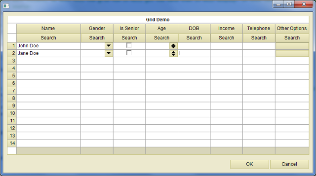
Final Outcome:
Login

Points of Interest

As easy and simplistic as this code looks, you will start realizing the power of this framework as you dig deeper into the various components. You can find more help on http://www.solidwidgets.com. The site includes a bunch of examples on how to use each component.

History

I hope this tutorial helps someone who needs to implement such functionality. Best of luck!

License

This article, along with any associated source code and files, is licensed under The Code Project Open License (CPOL)