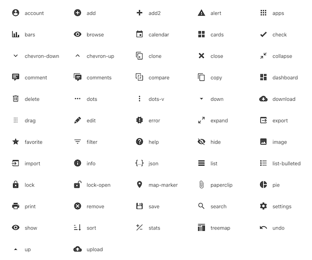
This article presents a set of SVG icons for CRUD applications. It is packaged as a React component with light and dark themes and a tooltip.
Set of 57 Icons
A set of SVG icons for CRUD applications (hand-picked among thousands at Material Design Icons) packaged as a React component with light & dark themes and tooltip.

Themes & Sizes
React-CRUD-Icons comes in Light and Dark theme.

... and 6 sizes: Tiny, Small, Medium, Large, Big, and Huge.

Installation
The package can be installed via npm:
npm install react-crud-icons --save
You will need to install React and PropTypes separately since those dependencies aren't included in the package.
Using the Code
Below is a simple example of how to use the component in a React view. You will also need to include the CSS file from this package (or provide your own). The example below shows how to include the CSS from this package if your build system supports requiring CSS files (Webpack is one that does).
import React from "react";
import Icon from "react-crud-icons";

import "react-crud-icons/dist/react-crud-icons.css";

const Example = () => (
  <Icon
    name="edit"
    tooltip="Edit"
    theme="light"
    size="medium"
    onClick={doSomething}
  />
);
Points of Interest
The component renders an inline SVG.
To package the code, I followed the steps from the blog post Building a React component as an NPM module by Manoj Singh Negi.
History
- August 9th, 2022: More icons
- November 20th, 2020: Initial version
