Introduction
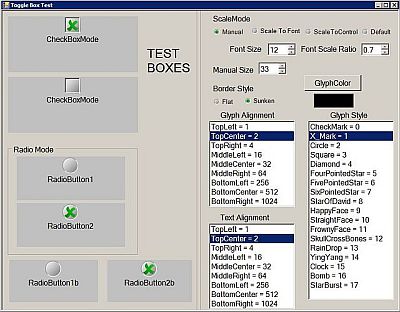
I begun noticing a trend of people asking for checkbox where the glyph can be sized just like the font instead of staying to the set size of 13 x 13. So what did I do? I went and created my own control that acts almost exactly like a checkbox... except you can scale/edit the size of the glyph!
After further reflection, I have also added a Radio Button Mode to the control. It acts just like any other radio button and can be grouped in containers.
Background
Things to know before starting:
- Your application must be set to compile as .NET Framework 4 (not .NET Framework 4 ClientProfile which is the default!) Go to Project Settings > Compile > Advanced Compile Options > Target Framework
- The word wrap option doesn't always work as expected, words can get cut off
- I haven't added a tri-state check yet to it.
- Auto-size is set to
false and cannot be changed. I'm not sure I'll implement this.
Version Change
1.0.1
- Changed
Radiobutton mode to not allow de-selecting selected radio button
Using the Code
The control for the most part works just like a regular checkbox.
See the attached project for an example of the majority of my added properties. It also contains the compiled .dll to just drop into your project.
There is one additional function I have added since it was a little pet-peeve of mine.
Dim BetterCB as New BetterCheckBox
BetterCB.Text = "Hello World!"
me.Controls.Add(BetterCB)
BetterCB.Toggle
Paste that function in any event you wish and it will create a new BetterCheckbox and toggle it to true.
Obviously, there are dozens of other properties you can set first.
To see it in action, download the example project from above and compile/run.
Preview

Added Functions
Toggle
Toggle the state of the Checkbox (or radiobutton) between True and False.
Added Properties
CheckBoxGlyphAlign
Get or set the alignment of the glyph within the control AS:
Public Enum CBAlignment
       TopLeft = 1
       TopCenter = 2
       TopRight = 4
       MiddleLeft = 16
       MiddleCenter = 32
       MiddleRight = 64
       BottomLeft = 256
       BottomCenter = 512
       BottomRight = 1024
   End Enum
CheckBoxGlyphBorder
Get or set the style of the glyph border AS.
Public Enum CBBorderStyle
       Flat = 1
       Sunken = 0
   End Enum
CheckBoxGlyphColor
Get or set the Glyph Mark color AS COLOR.
*Note: Rather than use a flat color, I do add a slight linear gradient to the check, barely discernible but I believe it adds a little extra to it.
CheckBoxGlyphStyle
Get or set the Glyph Drawing Style AS.
Public Enum CBGlyphStyle
       CheckMark = 0
       X_Mark = 1
       Circle = 2
       Square = 3
       Diamond = 4
       FourPointedStar = 5
       FivePointedStar = 6
       SixPointedStar = 7
       StarBurst = 17
       StarOfDavid = 8
       HappyFace = 9
       StraightFace = 10
       FrownyFace = 11
       SkullCrossBones = 12
       RainDrop = 13
       YingYang = 14
       Clock = 15
       Bomb = 16
   End Enum
CheckBoxManualSize
Gets or set the height of the Checkbox Glyph in pixels AS INTEGER.
*Note: There is a minimum of 15 for the manual method. And this property only has an effect if CheckBoxSizeMode is set to CBSizeMode.Manual.
CheckBoxSizeMode
Gets or Sets how the glyph is sized within the control AS.
Public Enum CBSizeMode
       ScaleToFont = 0
       ScaleToControl = 1
       Manual = 2
       MSDefault = 3
End Enum
ScaleToFont will scale the glyph as the font size changes *See CheckBoxSizeScaleRatio. Manual will scale the glyph based on CheckBoxManualSize. ScaleToControl will set the Glyph height to be the same as the control height - Margins. MSDefault will set the Glyph to the Default of 15.
CheckBoxSizeScaleRatio
Gets or sets the Scale Ratio of Glyph Size to Font size AS DOUBLE.
CheckBoxMode
Gets or sets the Mode the Checkbox is currently running in AS.
Public Enum CBMode
       CheckBox = 0
       RadioButton = 1
   End Enum
If the Checkbox is in RadioButton mode, it can be placed inside a container control to group them as normal.
TextAlign
Gets or sets the placement of the text within the control AS.
Public Enum CBAlignment
       TopLeft = 1
       TopCenter = 2
       TopRight = 4
       MiddleLeft = 16
       MiddleCenter = 32
       MiddleRight = 64
       BottomLeft = 256
       BottomCenter = 512
       BottomRight = 1024
   End Enum
*Note: If the glyph and text alignment are the same, the text will move so as not to cover the glyph. The text can still cover the glyph if the box is too small and the alignment is set to different locations.
TextWrap
Gets or sets whether text will wrap in the control if it is too long to fit AS BOOLEAN.
*Note: This does not always work as expected and can cut words off. Try editing the size of the control if this happens.
