Creating a Smart and Stylish Button
All of us have seen different types of buttons in different websites. So, here, we are going to create a simple and stylish Button.
Step 1: Creating an HTML Document
<body bgcolor="black">
<div class="content">
<br/><input type="button" class="button red" value="Apply Settings"/>
<input type="button" class="button green" value="Apply Settings"/></div>
</body>
First of all, we are creating two buttons using the above code.
Preview

Step 2: Creating CSS Document
.button
{
padding:8px 10px 8px 10px;
transition:0.2s all ease;
-webkit-transition:0.2s all ease;
-o-transition:0.2s all ease;
-ms-transition:0.2s all ease;
-moz-transition:0.2s all ease;
opacity:0.9;
border:none;
}
I have given class name to buttons here as button red and button green (Double Class Selector).
So firstly, I am applying style to .button.
Preview

CSS use here is:
- Padding creates space between table border and table content.
- Transition can add effect when changing from one Style to another, without using Flash Animation and JavaScript
->Opacity used for Transparency
CSS
.button.red
{
background-color:#d9522c;
border-left:4px solid #d9522c;
color:white;
}
.button.green
{
background-color:#009900;
color:white;
border-left:4px solid #009900;
}
Here we are setting Text Color and Background-Color for Button.
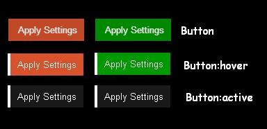
So, why do we use Border-Left here? Actually, in the next step, we are going to give :hover effect. If we do not use Border-left here than position of our button moves 4px towards right and size of button changes on hovering which we don't want.
Preview

CSS
.button:hover
{
opacity:1;
border-left:4px solid white;
cursor:pointer;
}
When we hover the mouse over the button then value of Opacity Changes From 0.9 to 1, border-left color to white and cursor is Pointer, which add a stylish look on hovering.
Preview

CSS
.button:active
{
color:white;
background-color:#191919;
}
The :active pseudo selector will match when an element is being pressed down on by the mouse Cursor.
Here is a final look at the button that we have created.
Preview

Hope you like it. Thank you!
