Creating a Stylish Glowing Button
All of us have seen different types of buttons in different websites. But Today the Button we are going to create is Special.
Step 1: Creating a HTML Document
<body>
<a class="large green button" href="#">Look at me!</a>
<a class="large blue button" href="#">Click me!</a>
</body>
We are going to create two button.
Step 2: Creating CSS Document
body
{
background-color:gray;
}
.large
{
color:white;
padding:10px 15px 10px 15px;
border-radius:10px;
text-decoration:none;
font-weight:bold;
}
Here We set background color of body to gray and for .large class we set font color,padding,border radius etc.
Preview:

CSS
@-webkit-keyframes greenPulse
{
from{background-color: #749a02;-webkit-box-shadow: 0 0 9px
#333; }
50%{background-color: #91bd09;-webkit-box-shadow: 0 0 18px
#91bd09; }
to{background-color: #749a02;-webkit-box-shadow: 0 0 9px
#333;}
}
@-webkit-keyframes bluePulse
{
from { background-color: #007d9a; -webkit-box-shadow: 0 0 9px
#333; }
50% { background-color: #2daebf; -webkit-box-shadow: 0 0 18px
#2daebf; }
to { background-color: #007d9a; -webkit-box-shadow: 0 0 9px
#333; }
}
We are going to add animation in our button's by using CSS3.
To create animations in CSS3, We will have to use the @keyframes rule.
The @keyframes rule is where the animation is created. Specify a CSS style inside the @keyframes rule and the animation will gradually change from the current style to the new style.
Inside Keyframe we have given the background-color and box-shadow color changing from 0%(from) to 50% and 50% to 100%(to).
CSS
 .green.button
{
-webkit-animation-name: greenPulse;
-webkit-animation-duration: 3s;
-webkit-animation-iteration-count: infinite;
}
.blue.button
{
-webkit-animation-name: bluePulse;
-webkit-animation-duration: 4s;
-webkit-animation-iteration-count: infinite;
}
Here we are applying our animation (@keyframe), animation duration and animation iteration (specifies the number of times an animation is played) to our buttons.
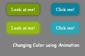
I have set green button animation duration to 3s and blue button animation duration to 4s.
Preview:
CSS
a.button:active
{
position:relative;
top:1px;
}
a.button:hover
{
mouse:pointer;
}
Finally we set here :active position from top to 1px, so that on clicking the button, it move slightly from its position and on :hover mouse appear as pointer.
That's all.
Hope you like it. Thank you.

