Problem
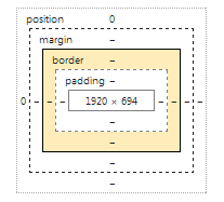
By default HTML element border is placed outside of element content. This is described in CSS box model:

But I've stumbled with case where new additional space outside element was undesirable.
So border must be placed inside element's content.
Solution
CSS3 box-shadow property can set shadow inside of element. So you can simulate border using shadow:
div
{
   width: 300px;
   height: 100px;
   background-color: gray;
   border: 5px solid red;
   box-shadow: 0 0 0 5px blue inset;
}
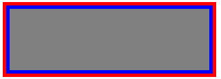
Result is:

Gray - element content, red - standard border, blue - inner border (shadow).
So element space is taken by gray area plus blue shadow border. And red border takes additional (undesirable) space outside.
Conclusion
You can use CSS3 box-shadow to get effect of inner border. But I believe that another techniques exist to get the same result.
Resources
