Introduction
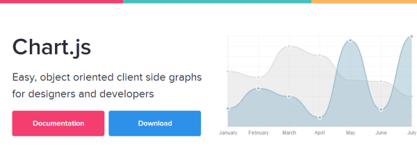
Of late, I am working on a project in which I have to create charts and graphs. Then, I came to know about chart.js. Using Chart.js, we can draw charts and graphs on webpage using HTML5 canvas element. We can create six types of charts using chart.js. In this tip & trick, we are going to see how to use chart.js for creating charts.
Let's Start
Firstly, we have to go http://www.chartjs.org/ for downloading chart.js JavaScript plugin. Clicking on download button will take you to GitHub page from where you can download the archive.

After extracting the files Chart.js-master.rar file, you will be able to find documentation, examples and chart.js file. Add chart.js JavaScript library into your document in between head tag.
<script src="js/Chart.min.js"></script>
I am using minified version of chart.js. Add <canvas> element with height, width and unique id.
Example 1
In the first example, we are going to create Pie Chart using chart.js. For creating a pie chart, a variable array (named pieChartData) is declared which contain value and color properties. Set the values and color depending upon your chart.

Chart.js provides various options for changing animation and look. You can change these options according to your wish.
For creating chart, we have to initialize chart class and pass our canvas element and "2D" drawing context and call the pie method.
<!Doctype HTML>
<html>
    <head>
        <title>Pie Chart</title>
        <script src="js/Chart.min.js"></script>
    </head>
    <body>
        <canvas id="pieChartLoc" height="300" width="300"></canvas>
        <script>
            var pieChartData = [
                {
                    value: 50,
                    color:"lightblue"

                },
                {
                    value: 10,
                    color: "red"
                },
                {
                    value: 40,
                    color: "green"
                }
            ]
          var myLine = new Chart(document.getElementById("pieChartLoc").getContext("2d")).Pie(pieChartData);
        </script>
    </body>
</html>
Example 2: Creating the Doughnut Chart
Doughnut chart looks much similar to pie chart except they have the centre cut out. Everything is similar to the above process except we have to call doughnut method this time.
<!Doctype HTML>
<html>
    <head>
        <title>Doughnut Chart</title>
        <script src="js/Chart.min.js"></script>
    </head>
    <body>
        <canvas id="doughNutChartLoc" height="300" width="300"></canvas>
        <script>
            var DoughNutChartData = [
                {
                    value: 50,
                    color:"lightblue"

                },
                {
                    value: 10,
                    color: "red"
                },
                {
                    value: 40,
                    color: "green"
                }
            ]
            var myDoughnut = new Chart(document.getElementById
            ("doughNutChartLoc").getContext("2d")).Doughnut
(DoughNutChartData);
        </script>
    </body>
</html>
Preview

Example 3: Creating the Bar Chart
For creating a Bar chart, we have labels (displayed on x-axis) and datasets (contains information about fillColor, strokeColor and data which is basically value on y-axis).
<!Doctype HTML>
<html>
    <head>
        <title>Bar Chart</title>
        <script src="js/Chart.min.js"></script>
    </head>
    <body>
        <canvas id="barChartLoc" height="300" width="300"></canvas>
        <script>
            var barChartLocData = {
                labels: ["January", "Feburary", "March"],
                datasets: [{ fillColor: "lightblue", strokeColor: "blue", data: [15, 20, 35] }]
            };
            var mybarChartLoc = new Chart(document.getElementById("barChartLoc").getContext("2d")).Bar
(barChartLocData);
        </script>
    </body>
</html>
Preview

You can also download the complete source code of the examples explained.
Hope you like it. Thanks!
