Introduction
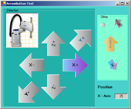
In an earlier VC++ (MFC) project, I designed a GUI with which the assistance robots in a machine could be positioned. For that I changed the rectangular button shape into an arrow shape. I have taken up the idea to program such arrows also in C# (.NET Framework). For that I read the most, very helpful, article about shaped forms on CodeProject. So with that information and the goal to deepen my knowledge in C# (GDI+, .NET Framework), I started the project. Here is the result.
Using the code
The project is designed as a custom control. In my article "PictureBox with zooming and scrolling", I described how to install and use such a control, or have a look at the different articles about that topic in CodeProject, for example "Writing your Custom Control: step by step" by Alexandr Khilov.
Methods / Properties
The control provides six designer related properties:

NormalStartColor, NormalEndColor -> Start- and End color for the LinearGradientBrush in normal state.
HoverStartColor, HoverEndColor -> Start- and End color for the LinearGradientBrush if the mouse cursor is over the arrow.
Rotation -> The pointing direction of the arrow in degrees. Starting with 0° at 12 O' clock raising clockwise to 360°.
ArrowEnabled -> Enable or disable the button. Act like the enable/disable in other controls.
Events
There is one public event in the class OnClickEvent. The event is fired if the mouse button is over the arrow and pressed.
Helper classes
The class BitArray is a simple helper class that I used to hold different button states (and to play a little bit with indexer). In the code you can see how to work with it.
ArrowButtonDesigner is derived from System.Windows.Forms.Design.ControlDesigner. A base designer class for extending the design mode behavior of a control. I used it only to hide properties.
A suggestion about the demo
Apart from the buttons -X and +X the other buttons have no function. If you click the x-value lower than 0 or make it bigger than 50, the HoverColor of the special ArrowButton will change to red.
Known restrictions
- If you make the arrow too big, sometimes the calculation to prevent clipping doesn't work correct.
- There is no test to check if the button text is correct in length and size.
