Screenshots
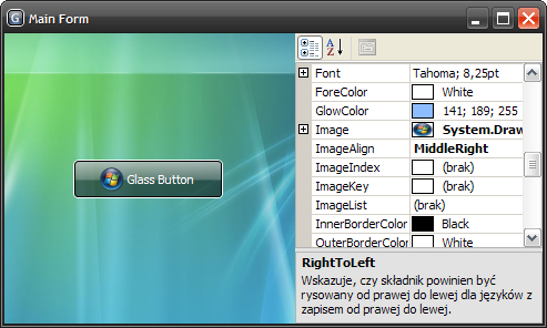
Sample application using a standard glass button with image.

The same application, but this time it has a customized glass button.

MFC application which hosts four glass buttons.

Introduction
I bet you have already seen animated task buttons in Windows Vista. I have. I was wondering how to create a similar control. Fortunately, I found a web page which describes how to do that using the Microsoft Expression Blend (Creating a Glass Button: The Complete Tutorial). The glass button (and thus the whole application) created with the Microsoft Expression Blend requires .NET Framework 3.0 to run. Because some people cannot or do not want to use .NET Framework 3.0 yet, I have decided to rewrite that cool control using only GDI+ so it would work with .NET Framework 2.0.
"Converting" XAML to C# (GDI+)
The tutorial from the page mentioned above was easy to complete, and the generated XAML code was so understandable that there were no big issues with a "conversion."
For example, I have translated the following code:
<Border HorizontalAlignment="Stretch"
        Margin="0,0,0,0" x:Name="shine"
        Width="Auto" CornerRadius="4,4,0,0">

  <Border.Background>
    <LinearGradientBrush EndPoint="0.494,0.889"
                         StartPoint="0.494,0.028">
      <GradientStop Color="#99FFFFFF" Offset="0" />

      <GradientStop Color="#33FFFFFF" Offset="1" />
    </LinearGradientBrush>
  </Border.Background>

</Border>
into:
using (GraphicsPath bh = CreateTopRoundRectangle(rect2, 4))
{
  int opacity = 0x99;
  if (isPressed) opacity = (int)(.4f * opacity + .5f);
  using (Brush br = new LinearGradientBrush(rect2,
                          Color.FromArgb(opacity, shineColor),
                          Color.FromArgb(opacity / 3, shineColor),
                          LinearGradientMode.Vertical))
  {
    g.FillPath(br, bh);
  }
}
(This is only a fragment of the DrawButtonBackground method.)
Even the animation of a hovered button was easily obtained by using the Timer class. Unfortunately, an animation is not quite smooth when a glass button is quite big.
How to Use the GlassButton Class?
The GlassButton class derives from the Button class so it can be used in the same way. Displaying an image on a glass button is also supported now. Even the guidelines work fine in the Visual Studio's form designer.
History
- 1.3.2 (02.11.2008) — Important! This is the last “standalone” version of the control. The next version will be included in a new project hosted at CodePlex.
- Fixed a bug that caused the button's image to be disposed in certain situations
- 1.3.1 (27.10.2008)
- The source code is now available both in C# and VB.NET
- Minor bugs fixed
- 1.3 (19.11.2007)
- The image is grayed when the button is disabled
- Added property '
FadeOnFocus' - Improved performance
- Minor bugs fixed
- 1.2 (31.03.2007)
- The 'disabled' look differs from the 'enabled' one
- Added some '
PropertyChange' events - Improved performance
- Split source code from compiled library and demo application
- Added MFC demo application
- Added toolbox bitmap
- Minor bugs fixed
- 1.1.1 (22.02.2007)
- 1.1 (21.02.2007)
- 1.0 (19.02.2007)
