Introduction
This review compares the use of a popup verses a new page to allow users to select options. Popup windows are often used to allow the user to make selections from a particular set of options that may be fixed or dynamic. However it is often superior to make those options a separate page, which may present more information and result in fewer clicks. This example contrasts the common calendar as a popup or as a new page. A link to an online demo of a calendar page is below.
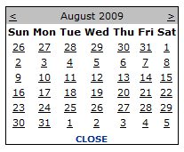
View of a typical calendar popup

This is superimposed in front of the current page and the user must narrow their focus to the window only.
An example full page calendar (75% scale)

This example is the entire focus for the user. The demo can be seen live at http://shofarnexus.com/Philosophy/PageLayout/PageVsPopup/Calendar.
Month Popup or 15 month Calendar page
For our discussion we will compare the typical calendar popup that shows the current month and allows direct clicking to a particular day. To get to other months you typically have to click forward or backward one month at a time.
Our alternative is a page showing a 15-month calendar starting with the current quarter. This assumes the application is requesting a date in the future. When arbitrary dates are being chosen, a standard 12 month calendar is probably preferred.
Number of Clicks
When using the popup to select a day in the current month you need one click to bring up the calendar and one click to select the date. For the page we need the same two clicks. However, when you are selecting a day in a future month, which will probably increase in frequency as the month progresses, one or more additional clicks are required. However, with the 15-month calendar we remain at two clicks, unless we are selecting a day more than a year in the future, which is unlikely.
Additional Information in the Calendar
Additional information can be presented to the user of the calendar, such as attributes assigned to days by color coding, or invalid days made non-selectable. For example if weekends or days in the past are not applicable they can be non-selectable, and premium days enhances with color.
Although this can be done in a popup, it is simpler to implement in a full page. With the additional real-estate, you can detail what your color coding means, or offer additional information about the selection process.
If your application requires both a start and end date, then you can make use of the information you have about the start date selection when presenting the calendar for the end date. For example, if the end date must be in a certain range from the start day, only those days could be selectable. Preferred dates can be highlighted. Obviously, the start date can be highlighted as it has already been selected.
Page Response Time
One of the arguments for a popup is to compensate for slow page response time. In the early years of the Internet, this was primarily due to slow connections. However, most delays now are due to the time the server takes to generate the page and the time the browser takes to render the page. Adding complexity to a page, as opposed to simple content, does contribute to slowing the response time. A page heavily weighted with content and script may present a significant wait for the user that would make repeated visits to that page undesirable and therefore make a popup preferable. Light weight pages that respond instantly, especially in intranet applications, do not have to contend with the respond time issues.
Demonstration
A live demonstration of the 15 month calendar can be seen at http://shofarnexus.com/Philosophy/PageLayout/PageVsPopup/Calendar, and the markup used to generate the page at http://shofarnexus.com/Philosophy/PageLayout/PageVsPopup/Calendar.shofar.
Our testing of a 15 month calendar page took an average of 10mS to process on the server and produced about 50K bytes of HTML. The testing was done on a modest late 2007 notebook (Toshiba A205-S6808).
Conclusion
On average, the new page will probably result in fewer clicks and allow for additional information to describe the options. When the weight of the main page is heavy so that there is an appreciable delay between the request and the rendered page, a popup reduces the number of delays the user must endure. When the page design is light and clean, especially in intranet applications with little network delays, a new page is probably superior to a popup.
