Introduction
Two weeks ago I was looking for a VS.NET-like Toolbox control. My
search was fulfilled by an article found on Code Project and written by
Iulian Serban ('A VS.NET-like ToolBox' posted on 20 Sep 2002). The
proposed implementation was a good one, but I found an important
limitation: it already included the behaviour and decorations of a
dockable window. So I decided to put my hands on that piece of code in
order to have a more general control. The new version differs from the
original one in the following:
- It does not implement any behaviour or decoration related to a
dockable window. You can use any available free library to do this
- It has been implemented in only one source file (and the
associated 'resx' file). so you can easy include it in any C# project
(no additional .dll)
- I simplified the tab animation code (and the animation too!)
- I added the support for items tooltips
- I added some new public properties to customize the look and
behaviour
- The original implementation uses the ListBox control to display
the toolbox items. I've replaced them with a Panel while items are
implemented with other Panels for which I wrote a specific handler for
the Paint event. This allows the toolbox to provide a more VS-like
look.
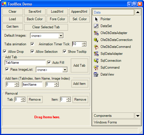
Basically the toolbox contains a set of tabs (folders) that will
contain a set of items that represents the objects you want to manage
through the toolbox. The items can be dragged and dropped over any
external control. Tabs are identified by a caption and their index
inside the toolbox, while items are represented by a caption, an id and
the index inside the tab they belongs to. Items can also reference a
generic object through the Tag properties like in most of the controls
you find in System.Windows.Forms.
Using the code
The control can be created like in the following piece of code:
Toolbox toolBox = new Toolbox();
toolBox.MovementTickInterval = 10;
toolBox.AllowSelection = false;
toolBox.ItemHoverBorder = Border3DStyle.Bump;
toolBox.ItemHooverColor = SystemColors.ControlLight;
toolBox.BackColor = SystemColors.ControlLightLight;
toolBox.ButtonColor = SystemColors.Control;
toolBox.ItemActivate += new Toolbox.ToolboxEventHandler(OnAddElement);
Each item in the Toolbox could have a small image attached to him.
This image must come from an ImageList. The Toolbox provides two ways
in which you can specify an ImageList to use:
- using the
ImageList property of the Toolbox itself. This is the
default image list.
- Through the two
AddTab methods. The first without the ImageList
parameter: it will use for the new tab the default imagelist. The other
in which you can pass an ImageList reference, this ImageList will
override the default. If you pass a 'null', no ImageList will be used
for the tab at all, even if the default image list exists.
After the creation of the Toolbox you can add Tabs and Items as you
like
using the public methods
AddTab and <code
lang="cs">AddItem. The
AddTab method
requires the caption of the tab to be created, a
ContextMenu (if any)
to be used inside the tab and an optional
ImageList, it returns the
index
assigned to the new tab. The
AddItem method
requires:
- the item caption
- the item id, this is the string used to identify the item when
it is dropped, activated (see later) or selected. You can put here, for
example, the name of the class to instantiate.
- the item description used by the item tooltip
- the index of the image to use from the tab's ImageList (if any).
- an object to be associated to the new item (like the Tag property
you can find in some
System.Windows.Forms controls). - a ContextMenu that will be opened with the right click on the
item and will override the tab's one.
- the index of the tab the item has to be added to
The AddItem method returns the index of the
new item in the tab. Here is a simple example of the usage of the <code
lang="cs">AddTab and AddItem methods:
AddTab("Tab 1", null);
AddItem("Item 11", "Item 11 ID", "Item 11 Description", 0, null, null, 0);
AddItem("Item 12", "Item 12 ID", "Item 12 Description", 0, null, null, 0);
AddItem("Item 13", "Item 13 ID", "", 0, null, null, 0);
AddItem("Item 14", "Item 14 ID", "", 0, null, null, 0);
AddItem("Item 15", "Item 15 ID", "Item 15 Description", 0, null, null, 0);
AddItem("Item 16", "Item 16 ID", "", 0, null, null, 0);
AddTab("Tab 2", null);
AddItem("Item 21", "Item 21 ID", "", 0, null, null, 1);
AddItem("Item 22", "Item 22 ID", "", 0, null, null, 1);
AddItem("Item 23", "Item 23 ID", "", 0, null, null, 1);
AddItem("Item 24", "Item 24 ID", "", 0, null, null, 1);
AddItem("Item 25", "Item 25 ID", "", 0, null, null, 1);
AddItem("Item 26", "Item 26 ID", "", 0, null, null, 1);
Interacting with the Toolbox
The Toolbox will provide the following public events:
public event ToolboxEventHandler TabChanged;
public event ToolboxEventHandler ItemSelect;
public event ToolboxEventHandler ItemActivate;
-
TabChanged: raised when the user clicks
on a tab button to open it. If the tab is already open, the event is
not raised -
ItemSelect: raised when the user clicks
(selects) an item -
ItemActivate: raised when the user
double-clicks (activates) an item
The Toolbox.ToolboxEventHandler is the
delegate used by the Toolbox for event handlers. The delegate and the
event args used are:
public delegate void ToolboxEventHandler(object sender,
ToolBoxEventArgs e);
public class ToolBoxEventArgs {
public string TabCaption = "";
public int TabIndex = -1;
public string ItemCaption = "";
public string ItemId = "";
public int ItemIndex = -1;
public object Tag = null;
}
In addition to the above events the Toolbox can manage the Drag And
Drop features of its items. The destination control will receive a <code
lang="cs">ToolboxEventHandler object containing the data of the
item to drop. Maybe the use of the same data for Drag & Drop and
other event handlers is not correct, but I do not like to have two
different classes to manage the same thing. Here is a simple event
handler to manage items drop:
private void OnItemDrop(object sender, DragEventArgs e) {
    ToolBoxEventArgs tea = e.Data.GetData(
    typeof(ToolBoxEventArgs)) as ToolBoxEventArgs;
    string txt = tea.TabCaption;
    if (tea.ItemIndex >= 0) {
        txt += "." + tea.ItemId;
    }
    eventPanel.Text = "Drop " + txt;
}
This event handler must be 'activated' using:
_receivingControl.DragDrop += new DragEventHandler(this.OnItemDrop);
or using the VS (or any other IDE) form designer. The Drag & Drop
function can be disabled through the toolbox's
AllowItemDrop<code
 lang="cs">
property (not the base
AllowDrop
one!).
An additional useful feature is the save and load of the toolbox layout
configuration in an XML document.
See the following examples:
XmlDocument doc = new XmlDocument();
doc.Load("test.xml");
toolBox.LoadTemplate(doc["Toolbar"]);
XmlDocument doc = new XmlDocument();
doc.LoadXml("<Toolbox>");
toolBox.SaveTemplate(doc["Toolbar"]);
doc.Save("test.xml");
As you can see the XML node that will contain the toolbox configuration
must be created before the call. In this way you can put the toolbox
layout configuration at any point in any Xml file you like.
Public Methods and Properties
Here you can find a brief summary of all the public methods and
properties provided by the toolbox.
Properties
-
BorderStyle BorderStyle: gets/sets the
border of the toolbox control public bool AllowSelection:
enables/disables the click (selection) of an item -
public bool AllowItemDrop:
enables/disables the drag and drop of items -
bool ShowToolTip: enables/disables the
use of item tooltips -
Border3DStyle ItemHoverBorder: gets/sets
the border used to highlight items when the cursor hovers them -
Border3DStyle ItemSelectionBorder:
gets/sets the border drawn when the user select an item -
Color SelectionColor: gets/sets the
item's background color used for selected items -
Color ItemHooverColor: gets/sets the
item's background color used to highlight items when the cursor hovers
them -
Color ButtonColor: gets/sets the tab
button's background color -
int MovementTickInterval: gets/sets the
animation tick interval -
ImageList ImageList: gets/sets the
default ImageList
int TabsCount: returns the number of tabs -
int SelectedTabIndex: get/set the index
of the selected (opened) tab -
string SelectedTabCaption : returns
the caption of the selected (opened) tab string SelectedItemCaption : returns
the caption of the selected item
-
string SelectedItemId: returns the Id of
the selected item string SelectedItemTag: returns the Tag of
the selected item
Methods
-
public void Clear(): removes all tabs
and
items from the toolbox -
public int AddTab(string caption, ContextMenu
menu)
: creates a new tab using the default ImageList
-
public int AddTab(string caption, ImageList
imagelist, ContextMenu menu)
: creates a new tab using the passed
ImageList
-
public int AddItem(string caption, string id,
string descr, int imageIndex, object tab, ContextMenu menu, int
tabIndex)
: adds a new item -
public void RemoveTab(int index):
removes the tab at index -
public void RemoveItem(int tabindex, int
itemindex)
: removes the item at itemindex in tab at tabindex public int GetTabIndex(string caption):
returns the index of the tab with the specified captionpublic void ClearTab(
int
index
): clears the items of the tab with
the specified index
public void SaveTemplate(XmlElement xml):
saves the toolbox layout to Xml using xml as
parent node -
public void LoadTemplate(XmlElement parentxml):
clears the toolbox and loads the layout from the xml node.
The new tabs will use the default ImageList -
public void LoadTemplate(XmlElement parentxml,
ImageList imagelist)
: clears the toolbox and loads the layout
from the xml node. All the new Tabs will use
the passed ImageList. -
public void AppendTemplate(XmlElement parentxml):
append to the toolbox the layout from the xml node.
The new tabs will use the default ImageList -
public void AppendTemplate(XmlElement
parentxml, ImageList imagelist)
: append to the toolbox the
layout from the xml node. All the new Tabs
will use the passed ImageList.
Changes
2.1: Added support to get the caption of the selected or activated item
What I still miss
I still have to disable/enable the scroll buttons according the actual
need of scrolling the items inside the tab. I didn't yet added the
run-time customization of the toolbox layout. Again, I spent some time
to fix the flickering during the scrolling, maybe something better
could be done.
If anyone has more cool ideas I will be very glad to write the code.
I'm currently using this control in a commercial application and it
seems to work smoothly, but I do not use all the features, so some bug
can still be there, I apologize for this.
I would also like to thank Iulian Serban that provided me with the
foundation of this control.
After several years of employment in the IT industry, I founded a software company together with three friends of mine. We develop Rating Engines for different markets (telco, finance, gaming, etc.). I'm in charge of the development of Graphical User Interfaces in C#.


 General
  News
News  Suggestion
  Question
  Bug
Bug  Answer
  Joke
Joke  Praise
  Rant
Rant  Admin
Admin 


 Submit an article or tip


