Introduction
This calendar control can be used in a web page to provide the user a way to choose month and year alone. It's a user control and so any number of this control can be added to a web page. This control is highly customizable, and could be extended much more. Some of the features in this control include - limiting the number of years the calendar allows the user to choose from, type of view (popup/panel), specify/extend the modes by which the date chosen is returned, specify the starting and ending years the calendar would allow the user to choose from, along with the ability to specify what comes first - the beginning year or the end year and so on. This user control and the sample application would also be very helpful to understand the core concepts of using a user control that greatly reduces the amount of duplicate code in a project apart from speeding things up.
Background
At work, I had a requirement - design a user control that allows the user to choose month and year alone. The day part would have to be decided after this step to be the first or the last day of the month. For this, a simple option would be to have 2 drop down boxes - one for the month part and one for the year part. But I felt that wouldn't be visually pleasing. So I set out to write a user control that is similar to the Calendar Extender that comes with the AjaxControlToolkit (or the Calendar control available as a server control). There were multiple reasons why I chose to write a user control instead of using 1 of the 2 I have mentioned above. First, in case we use the AjaxControlToolkit, the control does not directly expose a way by which the calendar could be limited to month/year alone. Sure, there are a number of ways posted in the web to circumvent this problem with a lot of JavaScript code. But in this case, if we need to use a number of similar calendar controls in the same page, we are in for a problem of spending a lot of time to achieve it, as it involves a lot of changes/experiment to the corresponding JavaScript. And we do not have the flexibility of limiting the user to a certain subset directly and so again we have to add JavaScript to solve this problem. For these reasons and many, I thought of writing a user control. So, I wrote a user control to accomplish this at work. Now I wanted to expand this idea to a broader perspective and present it for others to use. Hope this could be of help for others.
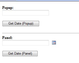
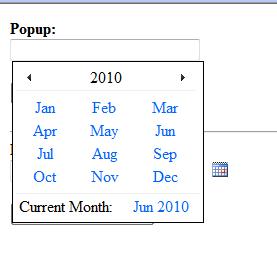
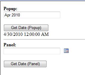
I feel that a small explanation of how the user interface presented could be used is required at this point. If the mode is set to 'popup', clicking on the text box pops up the calendar and selecting any of the month links or the current month link hides the popup after setting the chosen value in the text box. Clicking outside the popup dismisses the popup (See "Points of Interest" for more information on this).
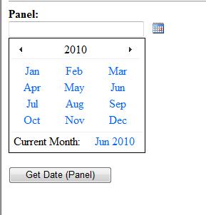
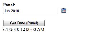
In case the mode is set to 'panel', a calendar icon is displayed next to the text box. Clicking on it displays the calendar and clicking on the calendar icon again hides the panel. Similar to the popup mode, selecting any of the month links or the current month link hides the panel after setting the chosen value in the textbox.
Using the Code
In order to use this control, follow the steps given below:
- Extract the user control source files, by default, they reside inside a directory named "Core".
- The contents of the "Core" directory includes the user control, Calendar.ascx, Calendar.ascx.cs, Calendar.ascx.designer.cs and a directory for the default images.
- Include the entire directory inside your project.
- Also you need to have jquery.js added to your project and reference it as shown below
- Apart from jquery.js, a reference to AjaxControlToolkit (DLL) should be added. Both of these files are included in the sample web project along with user control, you can choose to download either of this sample web project or the user control that does not include the additional files (jquery and ajax control toolkit).
- Assuming that the user control now resides inside the "Core" directory, it could be used as shown below:
Markup
<%@ Register Src="~/Core/Calendar.ascx" TagName="Calendar" TagPrefix="uc" %>
<html>
<head>
       <title>Calendar Demo</title>
       <script src="jquery.js" type="text/javascript"></script>
</head>
<body>
<form id="form1" runat="server">
<div>
  <asp:ScriptManager runat="server"></asp:ScriptManager>
  <uc:Calendar runat="server" ID="calenderCtrl1" BeginYear="2010" EndYear="2005"
			      ReturnFormat="Date" CalendarMode="Popup"
				DateMode="ReturnLastDayOfMonth" />
  <br />
  <asp:Button ID="btnGet" runat="server"
	Text="Get Date (Popup)" OnClick="btnGet_Click" />
  <br />
  <asp:Label runat="server" Text="" ID="lblResult"></asp:Label>
</div>
</form>
</body>
</html>
Code Behind
protected void btnGet_Click(object sender, EventArgs e)
{
    lblResult.Text = calenderCtrl1.DateChosen.ToString();
}
In the above example, the Calendar control is registered first using the tag and then user as <calendar> in the body. Just like other ASP.NET server controls, it has a runat and ID attribute. Apart from that, a number of other attributes are defined for this user control. They are explained below:
DateChosen - This is a read only property that can be used by the page that utilizes this user control to retrieve the month/year chosen by the user. BeginYear - The year that the calendar should begin with. Default is current year.Range - This property is used to specify from BeginYear how far can the calendar go. Default assigned if not passed is 5.EndYear - The end year that the calendar should display. If this property is assigned, it's used. Else it's calculated using the BeginYear and Range.ReturnFormat - The format the month chosen is to be returned. Possible values are Date and String. DateChosen property described earlier is the one that uses this to decide the format.DateMode - This is a user control to allow users to choose a month and a year. But when it is returned, it will still be returned as a datetime/string object with a month/day/year components. Convert.ToDateTime converts "June 2010" to "06/01/2010" by default. This property enables you to manipulate this. There are 2 choices - ReturnFirstDayOfMonth (default) and ReturnLastDayOfMonth. The former returns 6/1/2010 whereas the latter would return '6/30/2010'.DateOnError - If the month/year entered is invalid, by default the control returns 1/1/0001. This could be changed by using this property.DefaultDateType - If DateOnError is not set, what is the default date that should be returned - Minimum year or maximum year.StartMode - This property is used to determining whether the calendar should begin year first or the end year first.CurrentDayOrMonthInfo - Text to be displayed for the current month year information displayed below. Default is "Current Month:"CalendarMode - Type of calendar display popup/ panel. Default is popup.PopupOffsetX - Applied only for the Popup mode. X offset of the popup.PopupOffsetY - Applied only for the Popup mode. Y offset of the popup.PreviousYearImageURL - Image to navigate to the previous year. Default image is available in the Images directory.NextYearImageURL - Image to navigate to the next year. Default image is available in the Images directory.MonthLinkCSS - CSS for the month links. By default, no style is applied.MonthCurrentLinkCSS - CSS for the current month link. By default, no style is applied.
In the code behind, the date chosen by the user could be retrieved using the DateChosen property (read-only). This could then be used in the subsequent steps. Along with this article, I have attached the source for the control and a sample application with the required references (AjaxControlToolkit and jquery).
Samples
Live demo at http://thekfactor.info/CustomUserControls/CalendarDemo.aspx.
Initial Screen (unchosen state):
Popup sample (Set to return end of the month):
Panel sample (Set to return start of the month):
Point of Interest
Please look into the source code for the control. Here there is any update panel used with number of <asp:AsyncPostBackTrigger /> tags. This is to stop the link buttons from causing a post-back (links that represent the month and current month). Another way to take care of this is to put all of the calendar related controls inside another update panel. This was one thing that extended the overall time taken to code this control.
Also, please notice the JavaScript functions show() and click() [jquery]. This user control uses the AjaxControlToolkit's popup control extender for the popup mode. If this extender is used in a user control, clicking outside of the calendar and outside of the <div> area of the user control does not dismiss the popup. To solve this problem, show() and click() JavaScript code is used. show() function is attached to the textbox that is used to trigger the popup and click() function is attached to the root document so that the popup is dismissed on clicking anywhere in the document.
History
- Version 1 - Calendar user control released. I will update as and when I improvise the control.
