Live Demos
Features
Main features:
- Simple and clean look
- Multiple resources on the Y axis
- Customizable time scale on the X axis (one cell = 1 minute, 1 hour, 1 day, 1 week ...)
- Highlights business hours (customizable color)
- Automatically handles concurrent events
- Customizable event box (text, size, background color, duration bar...)
- Customizable fonts and colors
Database connectivity:
DataSource and DataSourceID properties supportedSqlDataSource XmlDataSource DataTable DataSet ArrayList - and other sources...
Event handling:
- Free time slot click event (automatic PostBack or manual JavaScript handling)
- Calendar event click event (automatic PostBack or manual JavaScript handling)
Licensing:
- Open-source (Apache License 2.0)
Compatibility:
- Internet Explorer 9
- Internet Explorer 10
- Internet Explorer 11
- Edge (the latest version)
- Firefox (the latest version)
- Opera (the latest version)
- Safari (the latest version)
- Chrome (the latest version)
Background Information
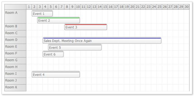
DayPilot Scheduler reuses the event arranging algorithms introduced in the DayPilot Calendar control (Outlook-like day and week view calendar/scheduler):

DayPilot Calendar detects blocks of overlapping events so they could be displayed properly. The width of each event box is adjusted according to the number of concurrent events:

DayPilot Scheduler uses the same arranging algorithm but the layout is different:
- The Scheduler shows the time on the X axis.
- Event box height is fixed.
- Concurrent events are handled by increasing the row height, not by shrinking the event box.

This reduces the concurrency problem: The increasing number of concurrent events doesn't reduce readability.
See Also
Minimal Setup Sample
<DayPilot:DayPilotScheduler
  ID="DayPilotScheduler1"
  runat="server"
  DataSourceID="SqlDataSource1"
  DataStartField="start"
  DataEndField="end"
  DataTextField="name"
  DataValueField="id"
  DataResourceField="resource"
  StartDate="2009-01-01"
  CellDuration="60"
  Days="1" >
    <Resources>
      <DayPilot:Resource Name="Room A" Value="A" />
      <DayPilot:Resource Name="Room B" Value="B" />
      <DayPilot:Resource Name="Room C" Value="C" />
    </Resources>
</DayPilot:DayPilotScheduler>
The first group properties defines the data binding:
DataSourceID DataStartField (starting DateTime)DateEndField (ending DateTime)DataTextField (event text)DataValueField (event id)DataResourceField (resource id)
DataResourceField is important - the values from this column will be matched with the resource IDs (Resource.Value).
The second group defines the time range and scale:
StartDate (first visible day)Days (number of visible days)CellDuration (cell duration in minutes)
And finally, it's necessary to define the resources (rows):
Resource.Name (row name)Resource.Value (row ID)
Usage Examples
Daily Scheduler

Settings:
Days="1"
CellDuration="60"
StartDate is set manually in the code behind:
DayPilotScheduler1.StartDate = DateTime.Today;
Weekly Scheduler

Settings:
Days="7"
CellDuration="1440"
The first day of week is calculated using Week.FirstDayOfWeek helper:
DayPilotScheduler1.StartDate = Week.FirstDayOfWeek(DateTime.Today, DayOfWeek.Monday);
Monthly Scheduler

Settings:
CellDuration="1440"
In this case, it's necessary to set the Days property manually:
DayPilotScheduler1.StartDate =
    new DateTime(DateTime.Today.Year, DateTime.Today.Month, 1);
DayPilotScheduler1.Days =
    DateTime.DaysInMonth(DateTime.Today.Year, DateTime.Today.Month);
Free/Busy Visualisation

This view doesn't show event name (DataTextField is bound to an empty column).
Settings:
DurationBarVisible="false"
EventBackColor="#4A71CE"
Timeline Visualisation

In the timeline view, the resources are replaced with events in the row headers. There is always just one event per row.
Settings:
DurationBarVisible="false"
EventBackColor="#CA2A50"
Gantt

DayPilot Scheduler can be switched to Gantt Chart mode using a single switch:
ViewType="Gantt"
In the Gantt mode, it will display each event in a separate row. See also a detailed explanation in the Gantt Chart Tutorial [code.daypilot.org].
CSS Themes
You can set the CSS theme using CssClassPrefix property. Several pre-built CSS themes are available. You can also browse a scheduler theme gallery or design your own theme using the online scheduler CSS theme designer.
White CSS Theme

Green CSS Theme

Transparent CSS Theme

See Also
DayPilot Tutorials
History
- January 20, 2016: New release: DayPilot Lite for ASP.NET WebForms 5.0 SP2
- April 16, 2015: Updated with DayPilot Lite for ASP.NET WebForms 5.0
- March 5, 2014: Updated with DayPilot Lite for ASP.NET WebForms 4.1
- November 26, 2013: Updated with DayPilot Lite for ASP.NET WebForms 4.0, new screenshots, NuGet package link added
- May 17, 2013: Gantt added, updated screenshots
- February 25, 2012: DayPilot Lite for ASP.NET WebForms 3.2 SP1 released
- February 4, 2012: DayPilot Lite for ASP.NET WebForms 3.2 released
- October 13, 2012: DayPilot Lite for ASP.NET WebForms 3.1 SP3 released
- August 8, 2012: DayPilot Lite for ASP.NET WebForms 3.1 SP2 released - Visual Studio 2008 project fixed
- June 8, 2012: DayPilot Lite for ASP.NET WebForms 3.1 released - allows custom event formatting for both Calendar and Scheduler controls (custom colors, HTML, duration bar using BeforeEventRender event handler)
- December 19, 2008: DayPilot Lite 3.0 SP1 released - a bug fixing release (
NonBusinessHours="HideIfPossible" mode fixed) - April 20, 2009: Release history link added. Minor formatting changes.
